file io stuff
Monthly Archives: January 2009
new look
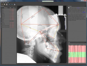
 this is what the new style looks like applied to rkm. the darker theme makes users concentrate on the image more rather than being blinded by the rest of the UI.
I’m still looking for matching icons that look stylish, but not childish or too colorful.
Preferrably, they are themed around a specific (not too intense) color.
menus, actions
print, about/splashscreen, load/save;
plugins:
* questionnaire
* automation
* validity check (diff to reference file)
updateDataLabel
some random code