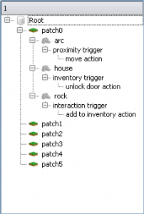
a Tree view, derived from the list view, displays all the existing terrain patches.
Tree structure:
- terrain patch
- item
- trigger
- action
- follow-up action (recursively)
- action
- trigger
- item
 This class is to be implemented as a singleton and has to react to selection changes in the world.
Whenever the user focuses on a new item, the tree needs to be notified and highlights that particular item.
The tree can then be used as a popup item for list views that maintain lists of target objects, actions, triggers, etc., as well as a scene overview allowing grouping and ungrouping of objects.
Upon building the item list, each entry has to be evaluated as to whether it has any children or not.
Since every hierarchy level of the scene graph bears its own item type, that method needs to be able to check the number of child items via a virtual method declared in the CPathItem base class.
In order to discern different entries, each of them needs to be able to display an icon.
actions:
single-clicking expands/collapses an entry
double clicking returns the pointer to the selected entry to the caller
double clicking opens the edit window of that item (edit window for objects is still missing)

change the stored data vector of the list view to a std::vector or a vector of a fixed-size array of qvariants instead of a vector of pairs.
std::vector vData;
assign a ‘role’ to each index of the QVariant-array:
enum ERole {
eDisplay = 0,
eData = 1,
eIcon = 2,
}
the scene graph tree view will be attached to the right side of the editor window, a button in the top right corner of the current editor window will toggle the view’s visibility.
This will be the only instance of the scene graph tree view.
Connections to existing elements of the scene graph will be created using drag&drop functionality.
e.g.
an AND logic action editing window is open
the window features a list view that displays any input logic actions
If a new element is to be added, dragging the requested element from the scene graph tree view to the list and dropping it there will add it to the list.
Deletion of an already existing element will be done via ‘delete’ button / key.
GuiItem gets a new property that describes whether it is fixed or dynamic in size along the x or y axis.
This will allow the grid class to manage fixed size objects so that they won’t be extended to the same size as all the other elements in the container.
the grid might also be extended: a new setter that fixes a certain row/column to a certain pixel size.
in order for the grid class to work properly with fixed-size items, it has to be altered:
reordering the grid now needs to take fixed-size items into account.
In order for the grid behaviour to adapt accordingly, a first ‘scan’ pass has to be added:
for each column
iterate through every item
if the item is fixed in the column direction, add its size to the total column size
if the item is dynamic in the column direction, set the column size to -1 and abort this column
compute the maximum column size and return it
if the function returns -1 (meaning there’s at least one dynamic item in every column), then keep the grid’s size and resize any dynamic item to fit the grid.
if the function returns a value > -1, then resize any dynamic item to fit the computed value (with respect to the fixed-size items in the same column), keep fixed-size items the size they are and finally set the new grid size to the computed value.
to resize dynamic items properly, each column has to know its fixed-size items and their cumulative size.
Subtract that cumulative size from the computed max-size of the grid and use the result to scale the dynamic items.
items now can have fixed or flexible resize modes in both dimensions.
The problem now is that when a container item is flexible and contains fixed items that force the container to a certain size, this can lead to a buffer overflow.
so whenever a flex-container gets resized due to fixed-size contents, its resize mode *needs* to be set to fixed, too.